Arriving at Penland School of Craft

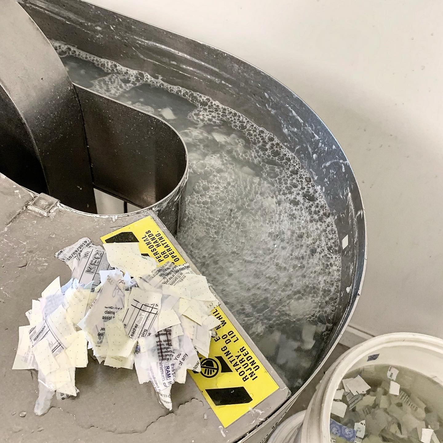
I arrived at Penland School of Craft on Sunday January ninth in the afternoon. It was a long day of travel to get from Denver to Asheville, after many hours of being double masked I was finally able to take a deep breath as I walked up to the paper studio.Since arriving I have spent a majority of the time preparing fibers to be used for various projects. 

The first day in the studio I soaked a pound and a quarter of bleached abaca. In the past I’ve been drawn to abaca because of its luminous qualities. Even thicker sheets are able to emit a subtle glow. While the abaca was being beaten in the two pound Reina beater, I went on a hunt for my packages. Once located I hauled myself back to the studio and eagerly unbound my fibers from the box in which they were thoughtfully packed. Among the mix of fibers I had saved were two and a half pounds of cooked and bleached Thai Kozo. I purchased the kozo in February 2020, and like many things in that year, my paper making plans got a bit derailed. In March 2020, I stuffed the kozo into a crisper drawer and figured the time would come eventually. Here we are two years later, I cut the long fibers into inch and a quarter pieces and soaked them overnight. The Thai Kozo was beaten for three and a half hours. The slurry came out so smooth and fine, I am eager to see what it looks like when dried. 

Among the precious parcels were three bags of bleached jute that had already been beaten for three hours. I decided to beat it for another hour, I have used the three hour jute before, so I am curious to see what an extra hour will do. I added/will add sizing and formation aid in adjusted quantities to all my mixtures. 

On Tuesday after emptying the beater of the kozo, I filled it up with water once again and began to beat the bits of recycled paper I had cut down the day prior. This mixture is the core of the project I would like to complete while here at Penland. The recycled paper is a mix of journal entries, pages of a planner that was well loved, and various pieces of printer paper containing important documents or records of the various ways I’ve spent my time. At first the slurry looked murky, the ink from countless pen strokes and toner that covered page after page, darkened the water. After swirling around for four hours, finally the recycled paper was ready. The slurry took on a lovely light grey color, with hints of violet. It turned out more beautiful than I could have imagined. I don’t want the paper to look obviously recycled, I’d like it to take on a new life and have little evidence of its previous use. 

Today, the third day of the residency, I was able to pull some sheets of kozo and recycled paper. The mold and deckle I am using is 18”x24”, my experience making paper at home restricted me to sheets no greater than 9”x12”. 

Forming larger sheets is so satisfying! It takes much more effort to plunge the mold and deckle into the vat and even more strength to remove it. Couching the sheets onto the pelons was a bit tricky at first, but after several imperfect attempts, I got the hang of it. 

Before shutting down for the day, I stacked the formed sheets between some blotters and cardboard to dry overnight. As I drift off to sleep, I am excited to wake up and see what the  fibers look like in their new form.

Picture Book of Textures

Learning about papermaking in the last several months has opened my eyes to the exciting uses and techniques papermaking has to offer. The ability to set up in my home enabled me to develop a new facet of my studio practice. I have used paper making techniques to develop substrates that have character and add an additional element to each new work.

            The layered wall hanging work called Shield inspired the composition and approach to the Picture Book of Textures. The major difference was the number of layers in the book, flipping past each page was like moving through a landscape where you could see only a little bit behind and ahead. The rest of the journey would reveal itself as the pages turned. Each layer was composed to complement or contrast the page before and after. The thickness of papers varied, and certain layers could be viewed through the sheet in front and affect the perception of the color and texture.


IMG_1361.jpg
IMG_1374.jpg
IMG_1377.jpg
PMBook_1.jpg
IMG_1390.jpg
IMG_1391.jpg

Yellow to Brighten the Day

Flax fibers are new to me and they are a surprisingly lovely fiber to work with. I am used to fibers that are longer, when you look at the vat, the clumping pattern tends to be much smaller. I specifically wanted to use flax to make a paper that has a crisp feel and where I could score the edges easily to make a book jacket. I wanted the jacket to be bright and stand apart from the books surrounding it. So naturally, I decided to dye the whole vat bright yellow. 

I prepped the fibers, blending the batches for around ten minutes each and adding retention aid. The yellow looked good when added to the mixture, the retention aid did its job, and it was bright! I pulled many sheets, as the vat got thinner, I added some freshly blended fibers. I ended up with a gradient exhibiting a variety of hues by the end. 

The jacket still has yet to be made, but I pulled so many wonderful sheets I impulsively threw some into the laser cutter to be cut along with some Abaca and Kozo papers. 

IMG_1139Small.jpg
IMG_1138reg.jpg
IMG_1267.jpg

Laser Engraved Plates for Printing

I have been using digital fabrication techniques for the creation of stencils and other printing apparatuses. I wanted to make something that would directly connect the hand-pressed print to the digital format prevalent in my studio practice. I am not usually drawn to direct representational image-making or the use of photographic elements within my work. This set of prints began as an exception to these preferences. However, since then I began to further incorporate the use of photographic elements in other projects.

IMG_9456.jpg
IMG_945211.jpg
IMG_94551.jpg

Recycling the Wardrobe

So, this was awesome!!! 

Apologies if the title was misleading, I did not in-fact recycle my own jeans for this one. I promise to do it in the near future because I have a pair of 501 jeans that need to be retired. This papermaking sesh started off with the intent to make some plain bleached flax sheets, but within the first four pulls, I was struggling to get the multi-hour beaten flax off of the deckle and onto the pelon. It was a battle I was not prepared for on this day. Laziness got the better of me and I decided to blend the denim fibers I had laying around. I tossed the mix into the vat and pulled a few sheets before everything was mixed together evenly. I am so excited by these results. I managed to get some interesting patterns and the thicker sheets came off the deckle, no problem. 

IMG_1250.jpg
IMG_1256.jpg
IMG_1260.jpg

Collagraph Prints on Tengujo Paper

This process, collagraph printing reminded me of doing paper collages with mod-podge as a kid. I built up layers of acrylic gel medium on mat board. Then quickly pillaged my box of random materials and found a bit of mesh, a failed paper cast remnant, a container of semi-dry granulated gel medium, and some other odds and ends. After cutting some shapes out of the screen mesh, I began to compose with the various materials and made sure to seal them with acrylic.


Earlier this week I found some paper stashed away; I was delighted to discover it was the paper I bought while visiting Kochi in the Southern(ish) part of Japan. I used most of the heavier weight Kozo for various projects throughout the year, but I have been reserving the thin Tengujo (典具帖) for distant projects. I decided on a whim, today was the day I would finally use it for something. 


After rolling the collagraph plate with Aquawash ink I delicately placed the thin paper on top. My usual methods of taking a print seemed too rough for this paper, I decided to use a gentler approach. I used the backside of a spoon, I worked through the sections making small circles as I applied pressure. Some of the areas were too raised and it was difficult to capture the ink on the surface. 


Since conducting this set of experiments, I have begun to look at the discarded bits in my studio as potential materials for future collagraph prints. I was not thrilled with the process at first, but after pulling several images, I came to see why artists still employ this method. I am equally excited to finally be using the Tengujo paper! I have six large sheets remaining and I’ve got a project in mind. 

Tengujo paper 典具帖和紙

Tengujo paper 典具帖和紙

IMG_1158Small.jpg
IMG_1159Small.jpg
IMG_1193Small.jpg

Pochoir

After doing some semi-failed experiments to cut a stencil using Duralar, I was tabbing though the layers of handmade laser cut paper and abruptly decided to use them. I secured a single laser cut paper to the face of handmade or watercolor paper, then using a flat stiff brush I stabbed gouache paint though each gap, this method is known as Pochoir. 

I never enjoyed using gouache in a traditional watercolor application. When aggressively applying the paint though a stencil, an exciting texture quickly reveals itself on the surface. Pochoir can be a very time consuming and precise method of monotype printmaking and painting all wrapped up into one tedious bundle…and I love it! The images here are experiments and compositions using the stencils that can be placed freely in the composition. I look forward to testing my patients in the future with developing an image with the need for registering lines.  

IMG_1217.jpg
IMG_1223.jpg
“Toning” the papers with watercolor paint.

“Toning” the papers with watercolor paint.

Texture details!

Texture details!

Stencil in use.

Stencil in use.

IMG_1218Small.jpg
IMG_1220Small.jpg

Digitally Fabricated Stencil for Monotypes

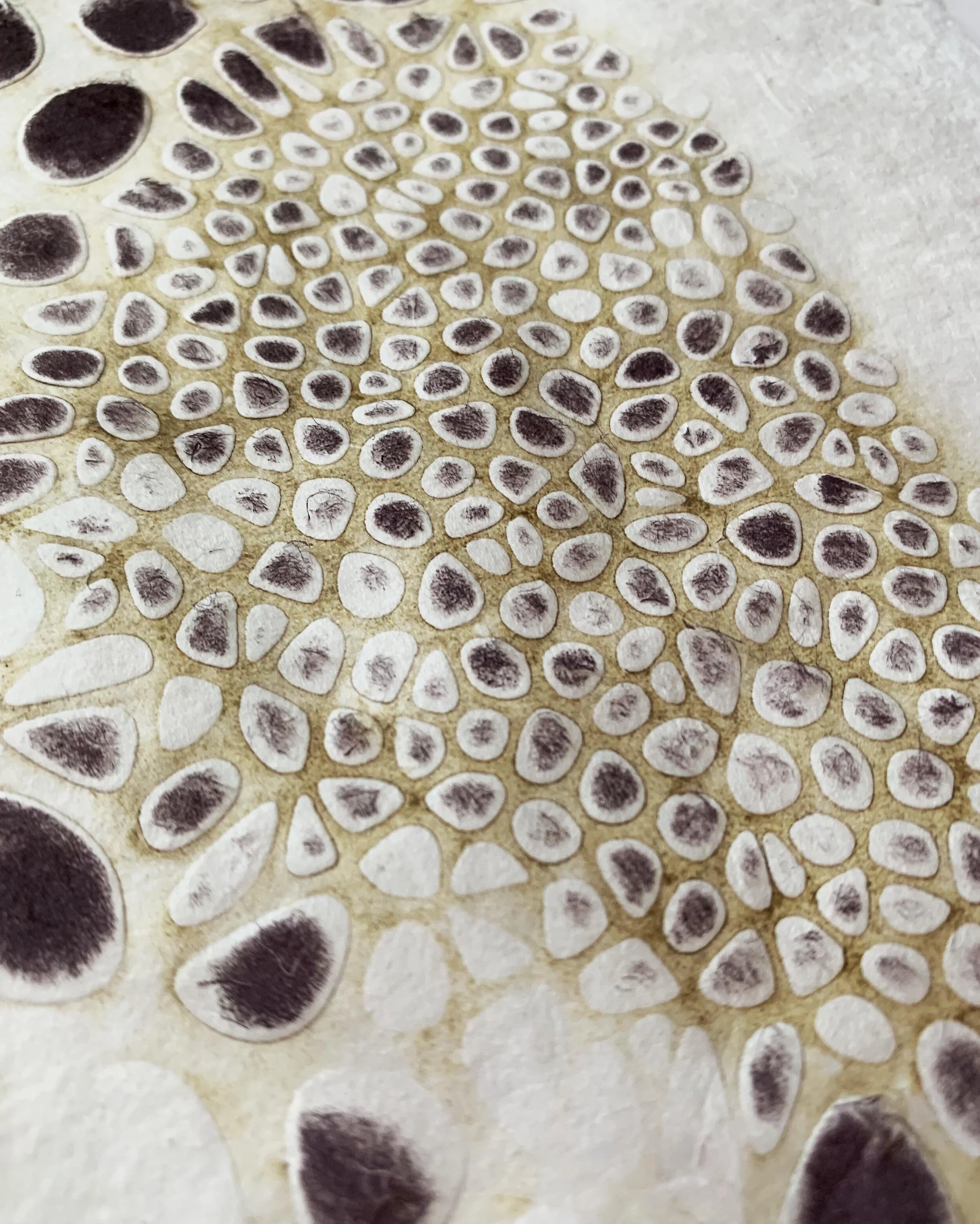
Stencils are not something I use frequently. I considered a wide variety of materials to use as a stencil, quickly I noticed the opportunity to blend digital and traditional techniques. The pattern seen in the images below comes from a digital model rendered in Rhino, built using an algorithm in Grasshopper. In grasshopper I used the Voronoi partition to triangulate points on a surface. This diagram is dual to the Delaunay Triangulation, you can read more about how that works here. The geometric angles were rounded, referencing the cell structures found in nature. 

To make the stencils I used the Epilogue Fusion M2 laser cutter. Its bed is 28” x 40” so it is considered large format and has the ability to cut through material as thick as a quarter inch. 

I made a paper sandwich starting with a 12” x 18” Bristol board, then placed one sheet of 8”x11” handmade cotton, two sheets of cotton abaca mix, one sheet of cotton abaca, and coffee fusion, and a flimsy piece of pure abaca on top. Gently I made sure everything was centered and taped down the edges In total six different sheets were stacked. The laser cutter had no problem with the thickness, all the cut shapes smoothly came out with a little shake. 

For this series of prints, again I used the Charbonelle Aquawash Ink. I positioned the cut Bristol sheet as the main stencil. I figured since it is a heavier weight paper it could last for many sessions to come. I did encounter issues with the thickness of the paper, when trying to pick up the ink in the negative space the pressure of my hand roller was not heavy enough to press the paper into the cutout areas. 

I did several experiments to see what kind of imagery I could pull up using the different weight papers as the stencil. When little ink was picked up, I used the hand press directly on the paper, the thickness of the stencil produced an embossed effect. When I removed the stencil, the opportunity for a ghost print looked good, using the 400 series dry mixed media paper I was able to get a clear transfer. 

As I continued to experiment I used some other laser cut pieces to build up layers of different stenciled shapes. Again, it was challenging to have an evenly pressed color transfer. Another issue I encountered was the shifting of the paper on top of the stencil. Even when it was taped down the paper still moved because of the multidirectional pressure of the hand press. 

I am excited to continue finding new ways of incorporating digital elements in this part of my art practice. Stay tuned! 

Papers on the laser bed after cutting was complete.

Papers on the laser bed after cutting was complete.

Layers of cut paper in variable configuration.

Layers of cut paper in variable configuration.

Ready for printing with Bristol paper stencil and aquawash ink.

Ready for printing with Bristol paper stencil and aquawash ink.

Ghost print after the first attempt using 400 series multimedia paper.

Ghost print after the first attempt using 400 series multimedia paper.

Other stencils layered.

Other stencils layered.

Ghost print backed by orange stencil print. Printed on handmade abaca paper with aquwash ink.

Ghost print backed by orange stencil print. Printed on handmade abaca paper with aquwash ink.

Abaca and cotton mix paper stencil with charcoal black aquawash ink.

Abaca and cotton mix paper stencil with charcoal black aquawash ink.

Handmade cotton paper with shifted stencil pattern using charcoal black aqua wash ink.

Handmade cotton paper with shifted stencil pattern using charcoal black aqua wash ink.

Embossed by pressure of hand help press.

Embossed by pressure of hand help press.

All Things Included

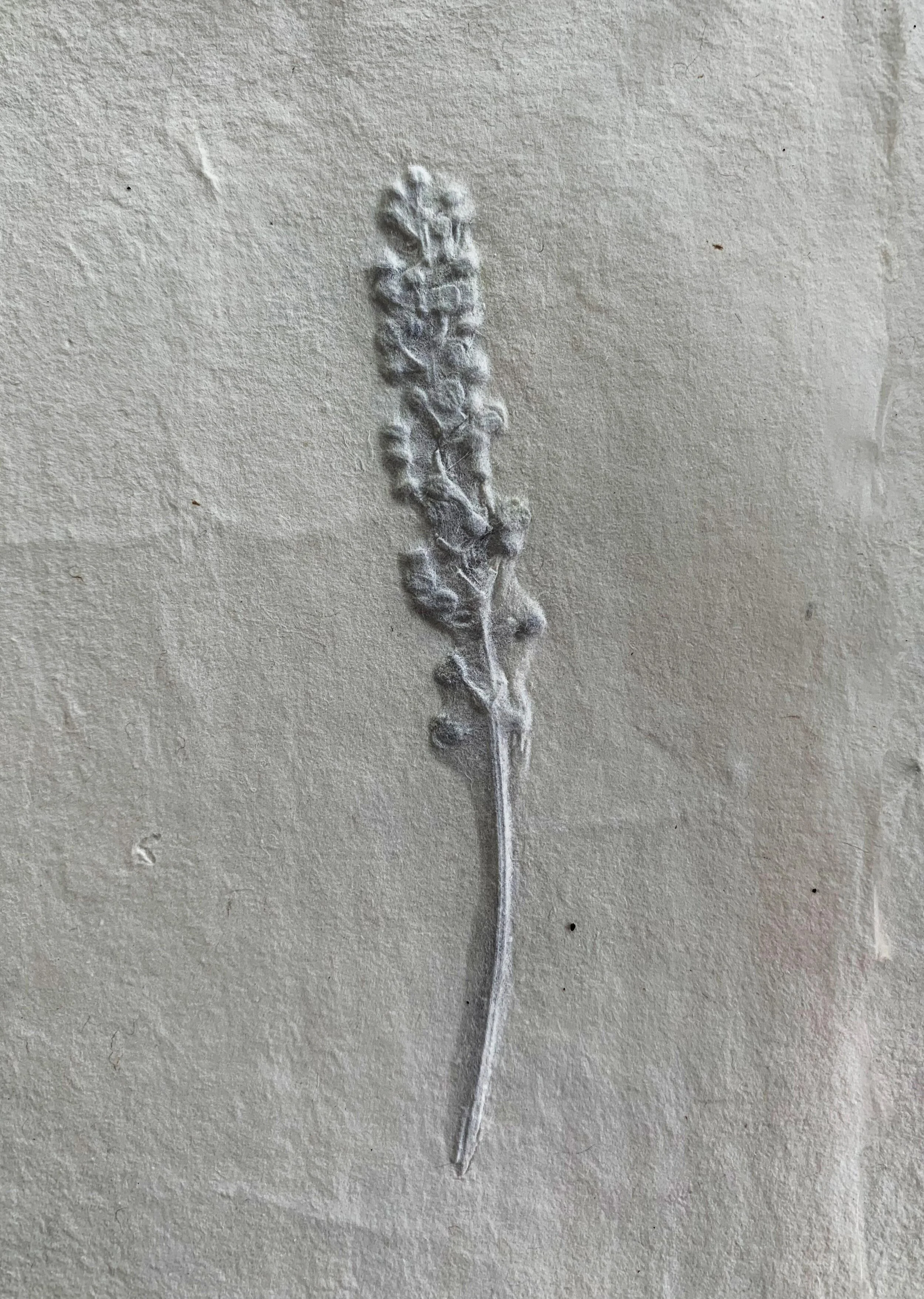
Inclusions in paper have been widely used to embellish and transform subtle fibers into sheets containing wonderful textures. I began this process by blending some of my remaining cotton and unbleached abaca fibers. Each batch was blended for a total of eight minutes. As soon as I pulled my first sheet, it was too thick for my liking, so I added a bit more water. After pulling a couple more test sheets I was able to get a relatively thin sheet and proceeded to add some pieces of the plants I collected from my lawn. I did not add the plant bits to the vat, instead I placed each one with great care and intention into the wet paper and proceeded to couch a new sheet on top of the sheet containing the inclusions.  I made several sheets with delicately placed flowers and leaves. I considered what other types of materials to add to the paper, this time I wanted to add something to the vat of fibers. 

Impulsively, I grabbed my French press, containing left over from the morning coffee and dumped the grounds in. After adding another batch of beaten fibers, I swished everything around and added a bit more sizing to the concoction and began pulling sheets of “coffee paper.” The wet fibers looked like a sampling of dirt from my garden. I had no expectations of the outcome; I was simply looking forward to having a highly textured surface to experiment on. Three days later, once all the papers finally dried, I was able to inspect my handywork. The color of the coffee paper is different than what I was anticipating, the color is more of a light gray than a brown. The coffee grains easily flake off the sheets as I rub them between my fingers. Looking closer I was able to see many of the coffee grains are trapped, dried between the fibers. After inspecting each coffee sheet, I continued pulled out the paper with the plant-based inclusions. They were exciting because of the textures that resulted from the patterns and makeup of each leaf and flower. 

In future works I intend to embed more types of materials such as pressed natural leaves and other types of fibrous inclusion. 

PM-Inc_1.jpg
PM_Inc_2.jpg
PM_Inc_4.jpg
PM_Inc_5.jpg
PM_Inc_6.jpg

Trace Monotype

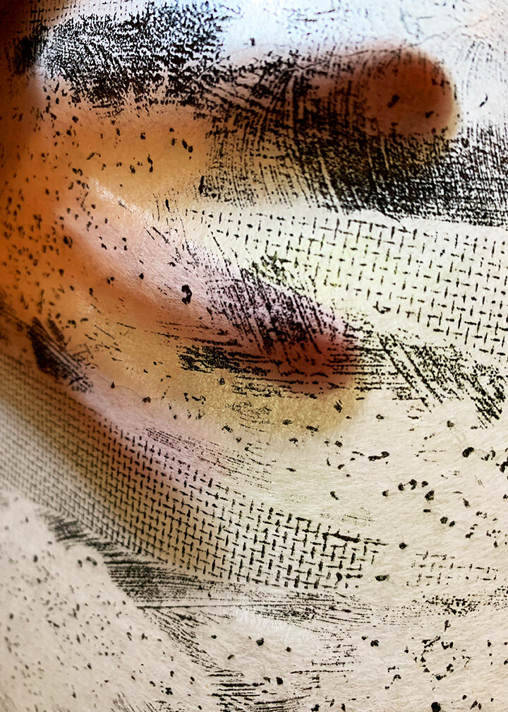
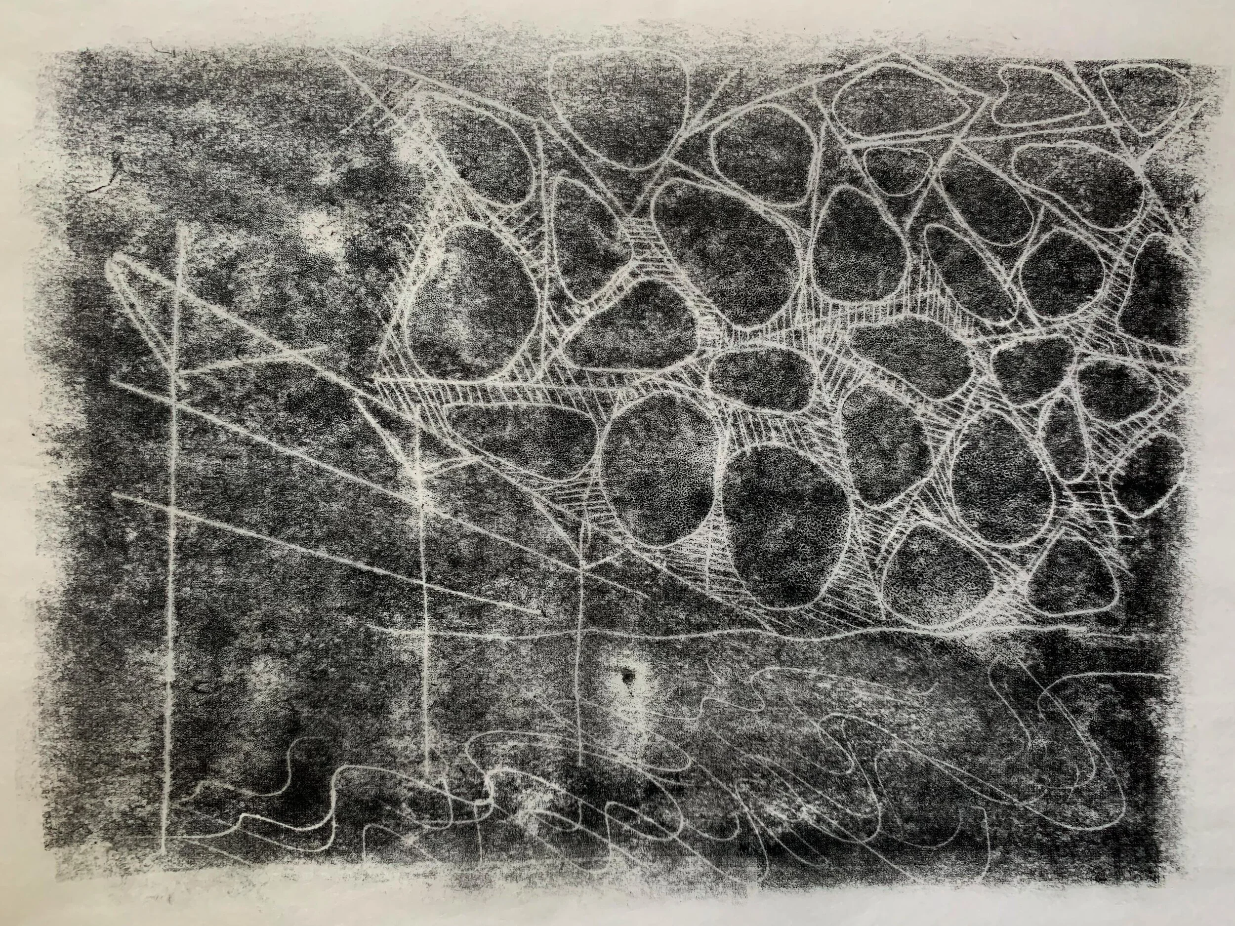
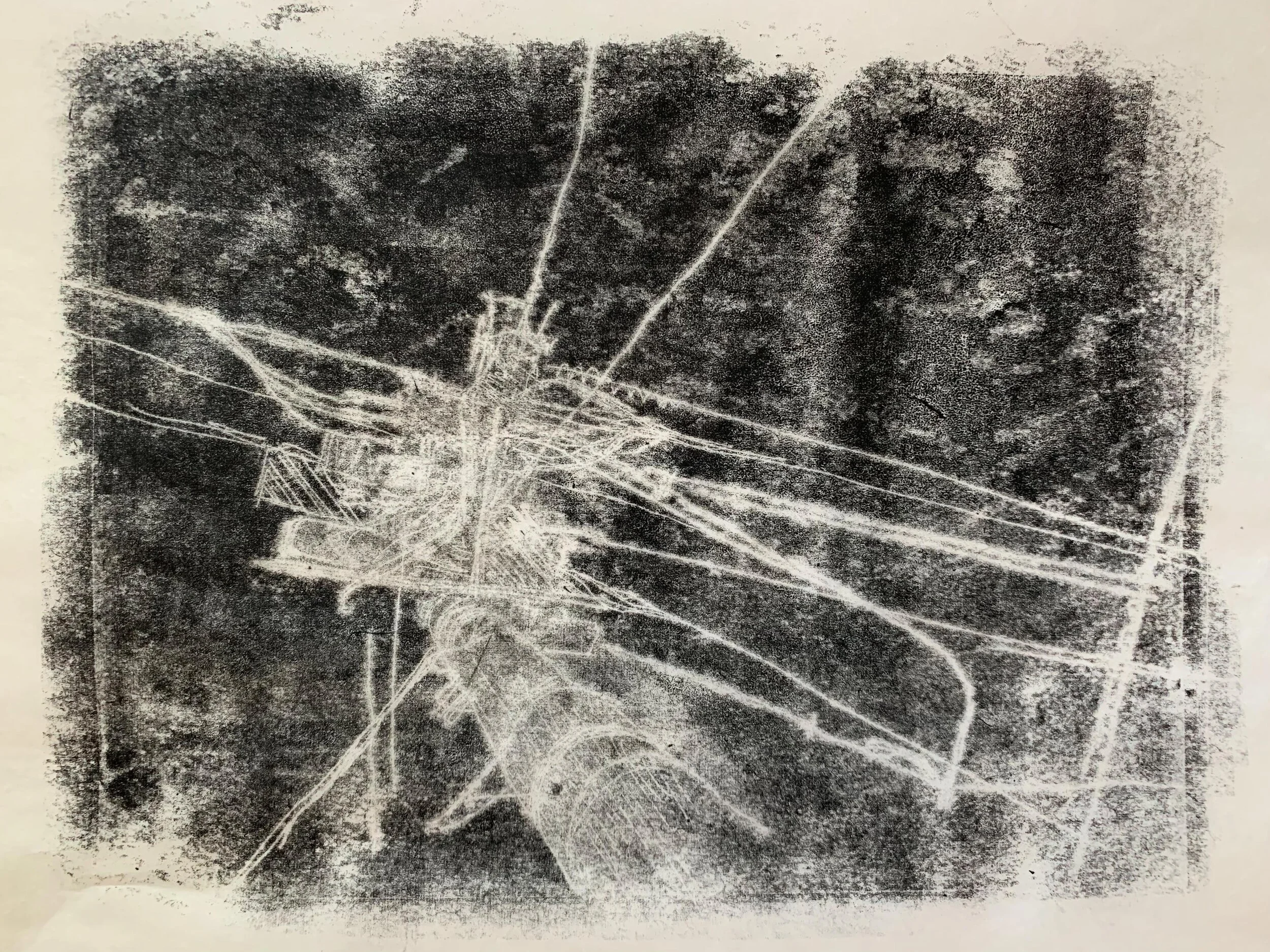
Today I worked with a technique known as Trace Monotype. This technique produces a style I find invigorating. With each type of paper, I get a very different line quality and overall image. During this session I used a light weight gampi paper, Japanese kozo, handmade cotton and abaca mix, 300 series drawing paper and 400 series mixed media paper. Quickly I learned how much I love to use gampi paper in this process. While drawing on top of the paper to create the traced image, the gampi is so thin it allows you to see every mark you make as the ink bleeds though the fibers. The gampi is able to pick up the ink is subtle ways, creating interesting affects such as in the first image, Evidence of Civilization.

Using the handmade paper continaing an abaca and cotton mix produced a variety of results because of the inconsistencies throughout each sheet. The line quality was visibly thicker than when using a lighter weight paper with smaller fibers. This paper was not too stiff allowing it to gently rest on the surface, rarely picking up ink from unintended areas. 

The 300 series drawing paper and the 400 series mixed media paper was like a rock in comparison, and picked up much more of the ink throughout the surface, developing a grainier image. I preffered to use the stiffer paper to pic up the ghost print in round two.

I adore this technique because of the illustrative aesthetic and the variety of line types I can achieve using various tools and materials. 

Evidence of Civilization - Gampi paper

Evidence of Civilization - Gampi paper

Evidence of Civilization (ghost print) - Gampi paper

Evidence of Civilization (ghost print) - Gampi paper

Magnesium and Charbonelle Aqua Wash ink, waiting patiently to be mixed.

Magnesium and Charbonelle Aqua Wash ink, waiting patiently to be mixed.

TraceMono_18.jpg
In process print, the Gampi paper is so thin the image is clearly visible before removing it from the plate.

In process print, the Gampi paper is so thin the image is clearly visible before removing it from the plate.

Kataharamachi

Kataharamachi

Kataharamachi (ghost print)

Kataharamachi (ghost print)

Kataharamachi II (ghost print)

Kataharamachi II (ghost print)

Linear Mapping - Handmade cotton abaca mix paper

Linear Mapping - Handmade cotton abaca mix paper

Mundane Proximity - Gampi paper

Mundane Proximity - Gampi paper

Mundane Proximity (ghost print) - 400 series mixed media paper

Mundane Proximity (ghost print) - 400 series mixed media paper

Window to Somewhere - Gampi paper

Window to Somewhere - Gampi paper

Reduction Printing

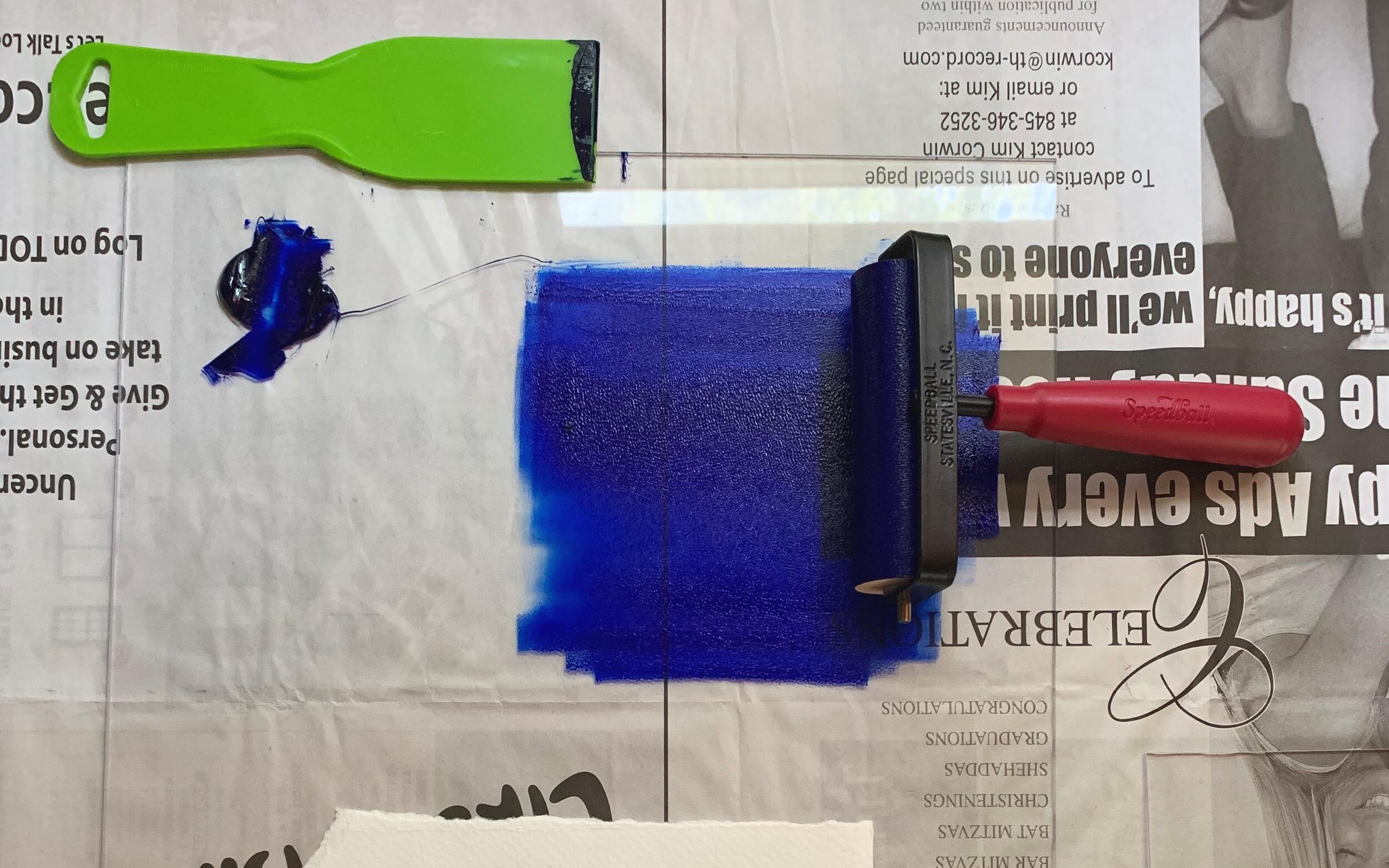
In this series of prints I used the Charbonnel Aqua Wash Inks and various household items to remove ink from the plate leaving traces of the marks.

Tools for mark making.

Tools for mark making.

M1_1.jpg

Experiments in Color 

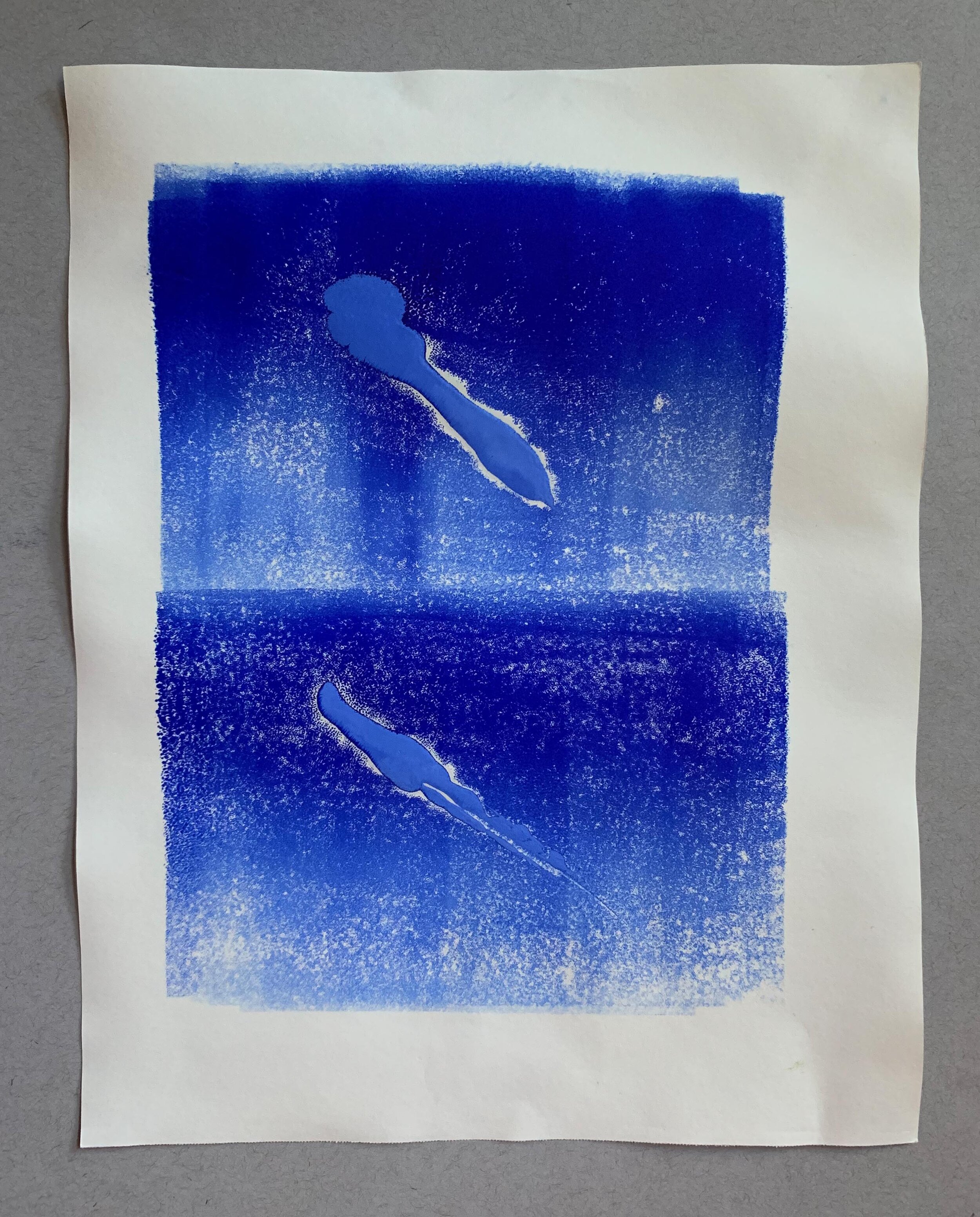
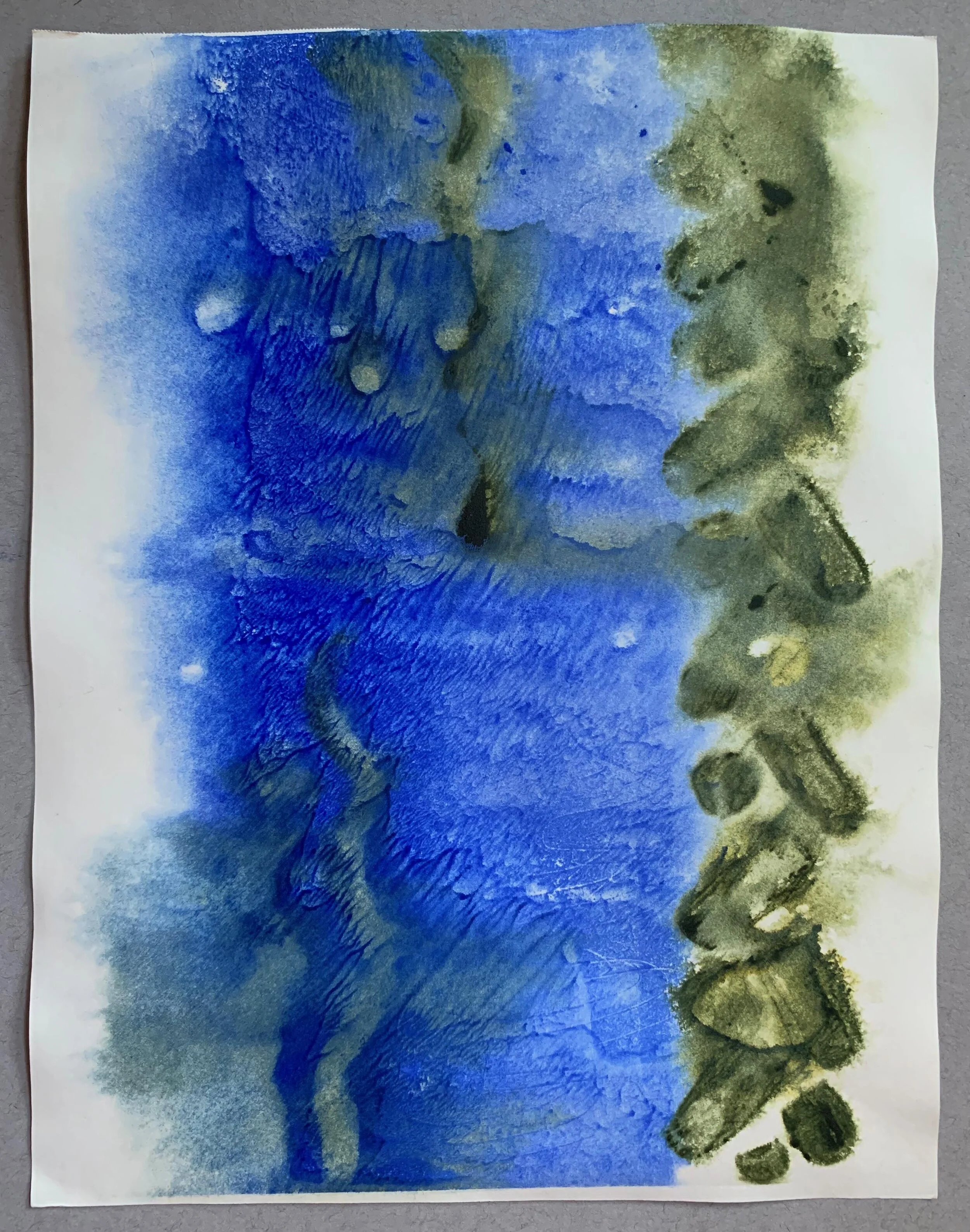
This week was filled with experiments using color! The inks used in for this series of prints are the Charbonnel Aqua Wash Ink. The pigment is vibrant and when mixed with water some interesting effects took place. Below are images of the process and the resulting monotypes.

I experimented with several types of papers during this process to see what could happen. I must admit the spontaneous patterns and reaction that come from using my own handmade paper is the most exciting. My early training as an artist has engrained a level of precision that I am unable to remove from my process. I consistently look for materials that allow me to subvert my style, using paper with imperfections becomes a welcome variable.

Each paper used in this process produced a very different surface texture. Here’s a list of what was used, 300 series Strathmore Bristol Paper, 400 series Mixed Media Paper, 400 series Drawing Paper, a leftover piece of mystery watercolor paper, and handmade paper using abaca and cotton fibers. Most of the papers were soaked prior to printing. The Bristol Paper had a fine tooth and took up ink evenly when it was dry when it was wet the ink was unpredictable, and removing the plate left a pattern marking the process.

I look forward to using water to manipulate the inks pushing them to interact with the properties of various substrates. 

Pre soaking papers.

Pre soaking papers.

Cosmic Reflections – 400 series mixed media paper

Cosmic Reflections – 400 series mixed media paper

Sudori – Handmade cotton and abaca paper

Sudori – Handmade cotton and abaca paper

Sudori, Ghost print – Watercolor paper

Sudori, Ghost print – Watercolor paper

The Floor is Lava – Dry, 300 series Bristol paper

The Floor is Lava – Dry, 300 series Bristol paper

Traces – Wet, Dry 300 series Bristol paper

Traces – Wet, Dry 300 series Bristol paper

Burning at Both Ends – 400 Series drawing paper

Burning at Both Ends – 400 Series drawing paper

Embarking on an Adventure

Paper using recycled fibers

Paper using recycled fibers

As the leaves turn from green to yellow, the temperature drops and we begin to settle into a new normal, I am slowly redesign my studio practice at home. Ijn the last two years paper has captivated my interest and become an important element in my creative process. This fall I look forward to experimenting with new fibers and altering the paper making process to fit my kitchen.

Scale is an important factor in my previous work. Making sculpture, paintings and prints the size of a human body is essential for the viewing experience. Although the home studio is not situated for large scale production of paper I am excited to find ways to work at a slightly enlarged scale. Some potential solutions to the issue could be drying sheets together, stitching them or weaving while wet.

Paper making as a process is quite electrifying, but what excites me is not just a flat material, but the potential for sculptural forms. Using various casting methods I will be using damp sheets to take the form of molds I have carved using some digital fabrication tolls such as the CNC router.

The Home Studio

Like many during this pandemic, I have made adjustments to my art practice. I have begun to use my home as a primary studio space. With each new project, my understanding of what is possible continues to expand.

Below are images of my three main work areas, each space engages different activities and provides the environment necessary to be productive!

Both the original desktop and the digital one.

Both the original desktop and the digital one.

The main work area, where most projects take place.

The main work area, where most projects take place.

An outdoor space where contemplation and material experimentation is welcome.

An outdoor space where contemplation and material experimentation is welcome.